Strategy, naming, identity, communication
Most organisations don't have a design problem. They have a clarity problem.
We're Alkamee. We find the one thing you are actually saying, then we make the name, the mark and every word around it say that, for years, without you having to be in the room.
Harold's Cross, Dublin 6W. Working with ambitious organisations since 2004.

The clarity test
Everything you could say is the reason nobody remembers any of it.
Pick a sector. Every line below is true, and all of them are competing. Step through what we do to them.
71 words on the page
- We are one of Ireland's leading energy suppliers.
- We supply gas, LPG and electricity nationwide.
- Our customer care team is available six days a week.
- We are committed to a lower carbon future.
- We have served Irish households for over fifty years.
- We offer competitive rates and flexible tariffs.
- Our engineers are qualified, local and on call.
- We deliver to farms, homes and businesses.
- Energy you never have to think about.
An illustration of the way we work, not a case study. The lines belong to no named organisation.
Book a clarity sessionUse the four steps, or the left and right arrow keys.
Selected work
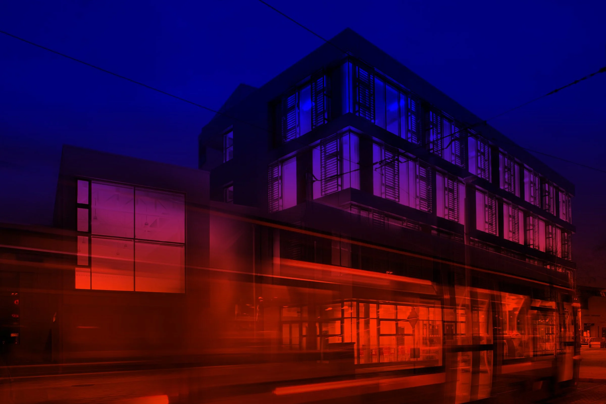
A brand is judged at the size a customer meets it, not on the presentation slide.
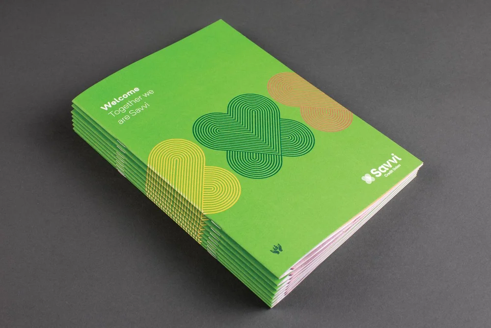
So this is the work at that size: printed, photographed, painted on a wall, cropped down to a single mark.


Place branding
If it only works in the brand guidelines, it does not work.
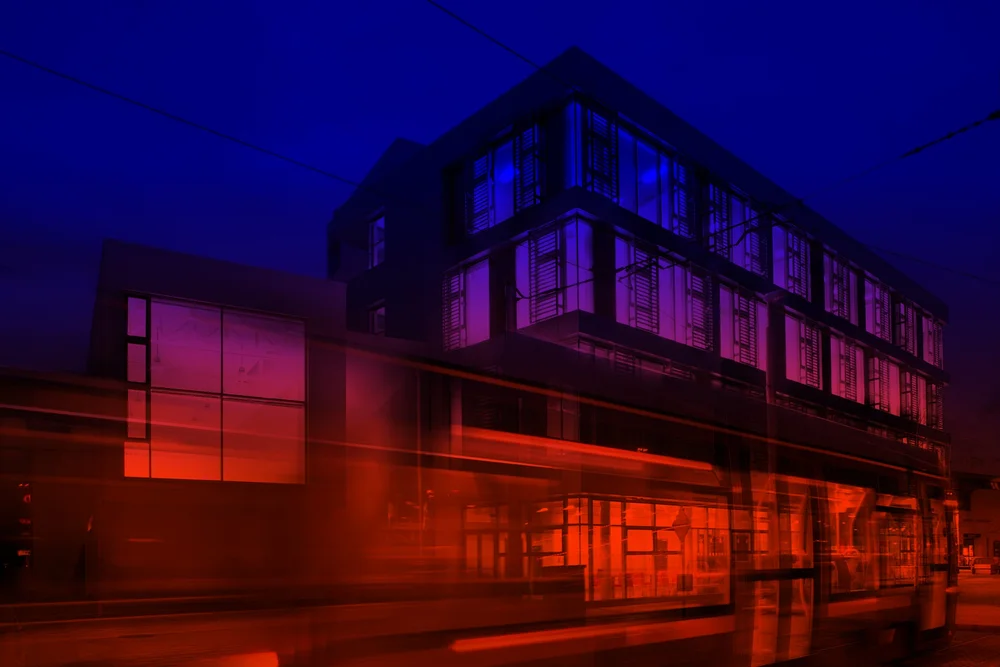
A name has to survive being glanced at from a passing tram, printed on a hoarding in the rain and typed into a search bar by somebody who half remembers it. We design for that reading, not for the pitch.
How we work
Four things, in order, and nothing starts with a logo.
Strategy
We start with what is already true. Research, conversations with the people who actually deal with you, and the patterns nobody inside has had time to name. The output is a decision about what to leave out.
Naming
The hardest working asset you will ever own, and the one you can least afford to test only in a slide. We say it out loud, in a room, down a phone line and into a search bar before anybody draws it.
Identity
The mark, the type, the colour and the rules that hold the whole thing together when you are not there to explain it. Built to work at a millimetre and at a storey high.
Communication
Then everything that carries it: the words, the photography, the printed thing in somebody's hand. One argument, repeated until people can say it back to you.
And after
Brands drift. We stay on as brand stewards when you want the position defended year after year, as you grow and change shape around it.
The studio
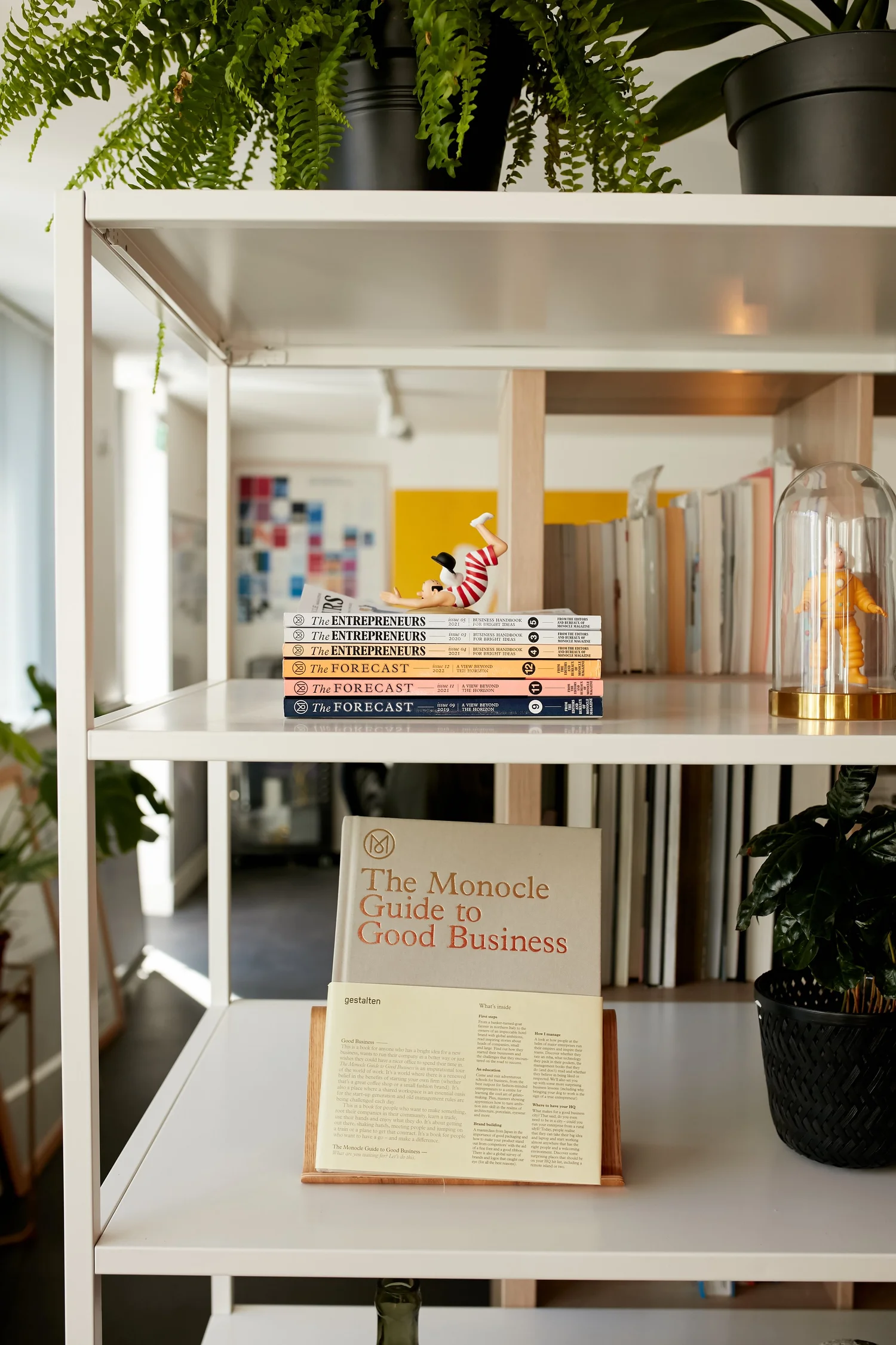
Two principals. One room in Harold's Cross.
Between us we have more than sixty years of branding behind us, in Ireland and in Australia, before we started this. You get both of us on the work, which is the whole reason a business the size of ours can sit across the table from a business the size of yours.
- Nik DillonPrincipal Alkamist
- Adam GallacherPrincipal Alkamist
“Energetic, enthusiastic & a pleasure to work with. A boutique sized creative agency who feel like and deliver high street agency results.”
Conor Stapleton, International Sales & Marketing Officer, Kaymed
Selected clients. Long-term partnerships.



Contact
Tell us what you keep having to explain.
That sentence is usually the whole brief. Send it over and we will tell you honestly whether your position needs rebuilding, or just deciding.